Brand Identity and Style Guide

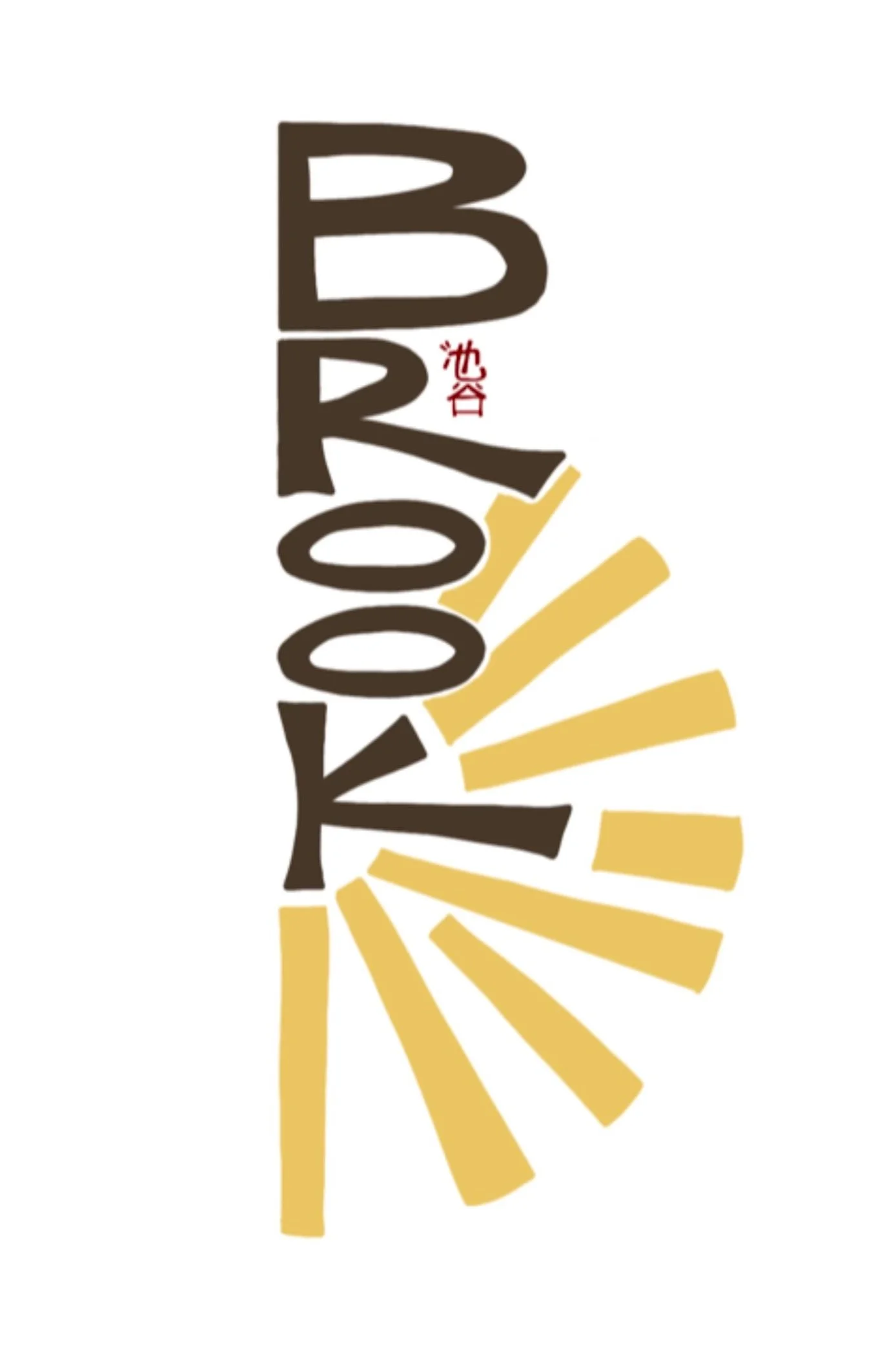
In crafting my design and brand identity, I sought to create a reflection of who I am and what I stand for. At the core of my brand is a profound sense of optimism that permeates my approach to design. To visually convey this optimism, my logo features radiant sunbeams, symbolizing not only my positive outlook but also serving as a representation of my inherent disposition. In a professional world that often demands conformity, individuals like me are often pressured to "tone it down" or conform to a more conventional definition of professionalism. However, I steadfastly believe that my unwavering positivity and sunny disposition are my greatest assets, and I remain resolute in refusing to be anything other than my authentic self.

horizontal black and white logoEmbracing my personal identity and heritage, I decided to incorporate my Japanese roots into my logo design. By integrating my family's traditional kanji, I pay homage to my ancestry and express a newfound sense of pride in my heritage. Once a source of discomfort, my Japanese heritage has now blossomed into a profound component of my identity, shaping who I am as a designer.
To forge an even deeper connection between myself and my work, I chose to hand-draw my logo. As a designer, I believe that the act of hand-drawing fosters an intimate and profound connection to one's creations. This personal touch enables me to infuse thoughtfulness into every aspect of my designs, resulting in work that is meticulously crafted.

A collage of examples of photos that would fit into my imagery guide. The only photo owned by me is the color exercise collage. All other photos are not owned by me and were sourced on the internet. In this exercise, I explored and curated my personal branding. Through the use of typeface, color, and hand-drawn elements, I created a logo and style guide that aligns with my design ethos as well as my personality.

vertical color logo
My family's Japanese kanji My color palette resonates with me on multiple levels, evoking a rich tapestry of emotions. With deep reds and browns, creamy off-whites, and hints of vibrant yellows, my palette combines soft and muted tones with energizing pops of color. These hues not only please the eye but also encapsulate the essence of spending time with me, creating a visual representation of the atmosphere I cultivate.
In developing my imagery guide, the overarching sensation I sought to convey was one of warmth and connection. I approached the imagery guide like a set of rules. All images relating to my brand (i.e. social media, website, etc) should be one of the following:
warm feeling images and renders
shots of buildings that emphasize the relationship between structure and landscape
hand-drawn sketches and process shots
interior shots that feel lived in, not cold and painfully staged
visually stimulating and thought-out collage work
The visuals and imagery associated with my brand aspire to evoke a genuine sense of warmth and foster a deep connection with my audience.
With this cohesive design and brand identity, I aim to establish an authentic and meaningful representation of myself as a designer. By incorporating elements of optimism, personal heritage, hand-drawn craftsmanship, and a carefully curated color palette, my brand stands as a testament to my unique spirit and invites others to engage with a warm and connected experience.
